
Is it a tent and a donut? A pointer and a circle? The letter A and the letter O?
The Australian Open has a new logo, but most people are not yet convinced that's a good thing. The Huffington Post Australia conducted a quick poll on day two of The Open, and 66 percent of respondents prefer the old one.
That's not exactly a warm response, and we understand that people often fear change, so we called the people who designed the new logo to get their take. You''ll hear from them in a tick. But first, a little history.
The old logo of the serving man was launched in 1995. The rumour is that the original hand-drawn sketch was modelled on Swedish tennis champ Stefan Edberg, who won the Oz Open twice in the 1980s.

People generally liked the old logo because it evoked the searing heat of an Aussie summer. But The Australian Open thought it had run its course. For starters, it was gender specific -- which doesn't make much sense in a tournament where men and women are paid equally, and where women make up the majority of fans in the stands.
The old logo didn't translate well into the digital sphere either. Clearly it was time for an upgrade. But what?
Branding agency Landor won the job.
"In brand terms, the Australian Open is quite ambitious," Landor general manager Nick Davis told The Huffington Post Australia. "They have genuine aspirations to be known as an entertainment brand regionally and at a global level.
"The old logo had been around for a long time and people knew it and recognised it, so the challenge for us was how to repurpose that to stand for entertainment."
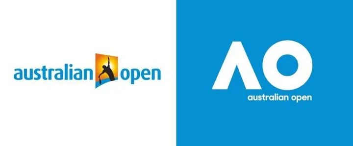
Davis said his team's intention was never to display "what's in the tin". Think of his point this way: Tim Tams have a picture of Tim Tams on the packet. But The Open, according to Nick Davis, didn't need to portray tennis in its logo.
"We could have gone down the route that more overtly had tennis players or tennis balls, but in most categories you don't need to spell out who you are or what you do."
OK, so no sundrenched player required. But can the pointer and the circle really reach us on an emotive level? Do the little blue symbols smack us as hard as a Nick Kyrgios serve and go "that, right there, is the essence of the Australian Open"?
Not yet, no, if our poll and the wider reaction on social media is any guide.
Davis knew was prepared for a backlash. He knew acceptance would not be instant.
"The feedback is as we expected, which is pretty harsh. I have never ever done a significant rebranding where there's no instinctive knee-jerk. The old logo was loved because it was the old logo and people felt warm around it because it's been around so long. These things take time to bed in and settle."
Davis went on to say that a logo's objective is not to be liked.
"It's to carry the business forward and be a suitable identity for that business."
Davis is hanging tough in the face of a collective Australia-wide "meh". And who knows? Maybe the "meh" will morph into a more considered "hmm" and perhaps even a "mmm" of approval.
Interestingly, Davis told us that there is also a burnt orange version of the blue logo. The Open can also do fun stuff like using the circle and the pointer to make a sun with little rays of sunshine.
"We can communicate many things with a really simple system," he said.

We think it's great that the elements of the logo can be played with. There's clearly a lot more going on here than meets the eye.
But for now, like many Australians, we're pretty much just seeing tents and donuts. Which kind of makes us want to go camping and eat junk food more than it makes us want to watch tennis.