If any company can capture the world's attention with the removal of a few serifs, it's Google.
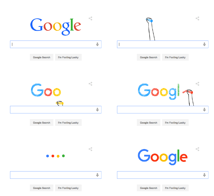
The search engine giant on Tuesday received an updated logo, featuring a sans-serif font and brighter colors. The company announced a couple other new designs, too: Four animated "Google dots" will appear in certain Google services when new information is loading or processing; and a new "G" icon will be used in small spaces like app logos.
The company, which has undergone several logo changes since launching in 1998, revealed the changes in an animation on Google.com (below) and a video that takes viewers on a journey through Google's history (above).

The company explained that the new design elements are intended to improve the look of the brand for users experiencing Google on different devices and platforms.
"Once upon a time, Google was one destination that you reached from one device: a desktop PC. These days, people interact with Google products across many different platforms, apps and devices—sometimes all in a single day," the company wrote in a press release.
"Users now engage with Google using a constellation of devices, and our brand should express the same simplicity and delight they expect from our homepage, while fully embracing the opportunities offered by each new device and surface," the company explained in a blog detailing the design process.
The design change comes just weeks after Google announced it would be folded into a new parent company, Alphabet.
What do you think of the logo change? Tell us in the poll, below:
